


Project Overview
Create a three breakpoint design (desktop, tablet, and mobile view) for a crowdfunding startup that focuses on local small brick and mortar businesses. The crowdfunding platform’s focus is to connect entrepreneurs with investors and also display prototype. It will allow entrepreneurs to gain the necessary funds to launch their business. While the Investors would gain equity ownership based on the investment amount.
Goals
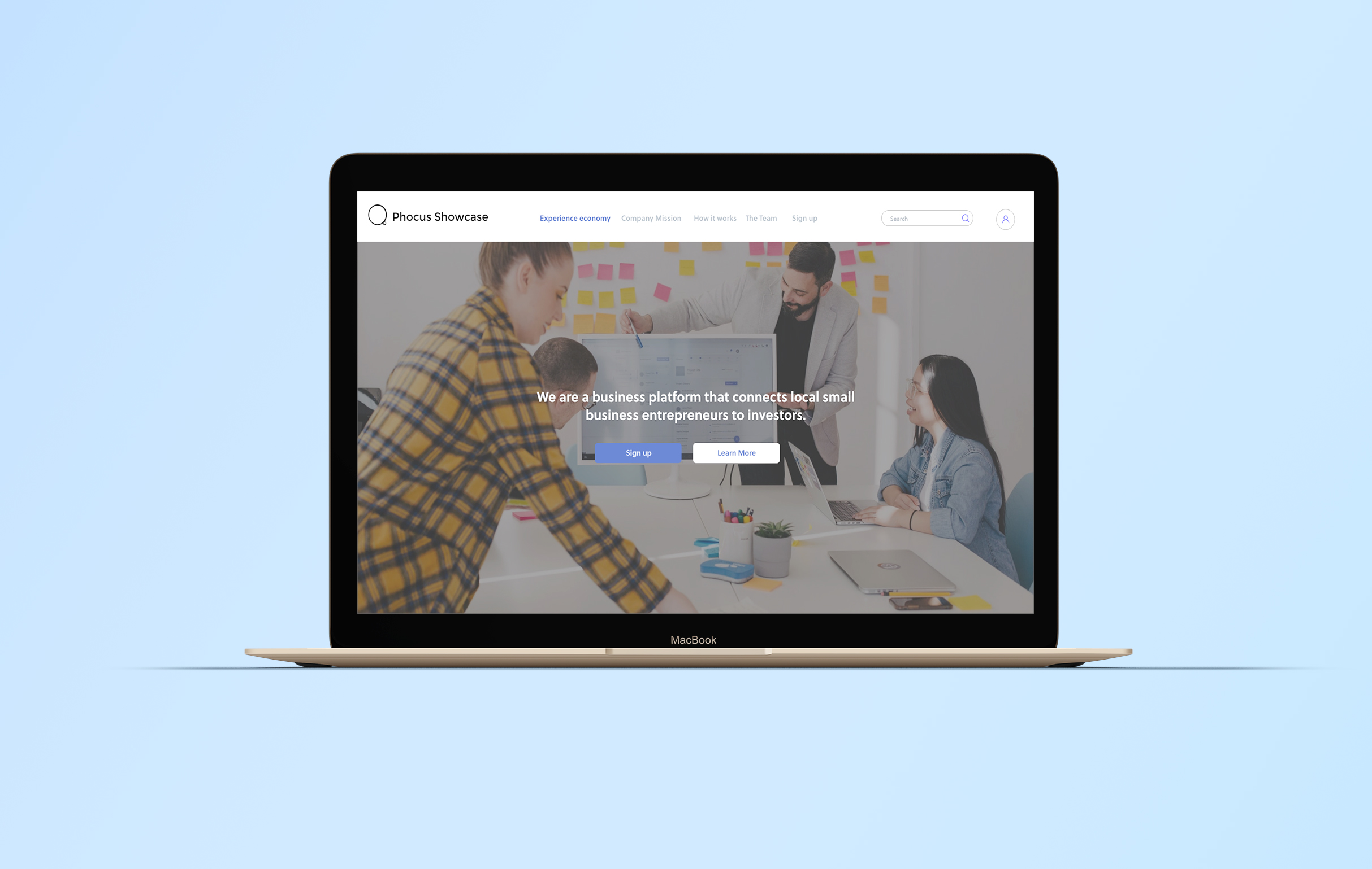
Create a single page marketing website that explains in detail what is the experience economy. As well as the value proposition for investors and entrepreneurs.
Above the fold/hero image with a strong call to action
“Experience economy” Overview
Company and product details
How it works for entrepreneurs and investors
Signup section for both entrepreneurs and investors
About the team
Deliverable
3 breakpoint prototype (desktop, tablet, mobile )
Styleguide: platforms name, color palette, and typography, image content
User personas
Mockups
Research
The research began with looking at other crowdfunding platforms to understand what similarities and differences that each of the platforms has. The common factor of crowdfunding platforms is that they are means to gain capital for the launch of a product or service. The difference is either the industries that the platform focuses on or the investment amount to enter the platform. For example, Kickstarter uses creators with both small and large fanbases to create content on their platform. While Seedinvest is a platform that vets the entrepreneurs’ ideas and presents the selected to top 1% earners with additional benefits. Additionally researching the pros and cons of having a crowdfunding-based platform and the user pool to understand the goals and pain points that they have.
Challenges
The challenge for this project was making the Crowdfunding platform different. For example, due to the startup focus on brick and mortar experiences, the investment would be more. Since the client deliverable is to create a single-page website it not only has to be engaging to the audience but it also has to be a concise presentation. Also, the user interface components had to suited for responsive based design to make it a great presentation in all breakpoints.
Solutions
Naming the crowdfunding platform Phocus Showcase was to differentiate that this platform was focusing on showcasing experiences that customers would like to repeatedly return to enjoy. As well as letting both investors and entrepreneurs know that Phocus Showcase that there are win-win opportunities for both sides. To not only invest in a brick and mortar experience early in exchange for equity shares. As well as giving the entrepreneurs opportunities to showcase their ideas in an environment that attracts investors and polishes their business ideas.
For the website structure since it is a single page marketing website, there are advantages and disadvantages to this style of the website. Due to the platform being in the startup phase a single-page website layout has to be concise and engaging to not overwhelm the audience with information. Additionally being concise also helps to structure the website since it is made to have essential information to give the audience a quick impression of the content. For example in the explanation for “What is the experience economy” and “How it works” sections, the content is done in a brief bullet-point manner. Additionally for the gallery section “Popular Showcases” and “The Team” a card-style interface was chosen because it is a versatile solution to fit the content easily to the breakpoints. Furthermore, the signup section was to the point and the user can check off the investor or entrepreneur notification box to receive the appropriate emails.