Overview
The project was to create a mobile app that is based on a floral arrangement delivery service for customers to have their orders delivered within the hour. The Floragogo company is a startup and want to expand their market.
Goals
Differentiate from competition by focusing on the mobile app experience.
Getting quick delivery time for locals.
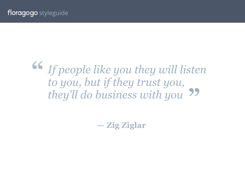
User-friendly experience for both the user and florist.
Have an order tracker to inform update users and florists.
Deliverables
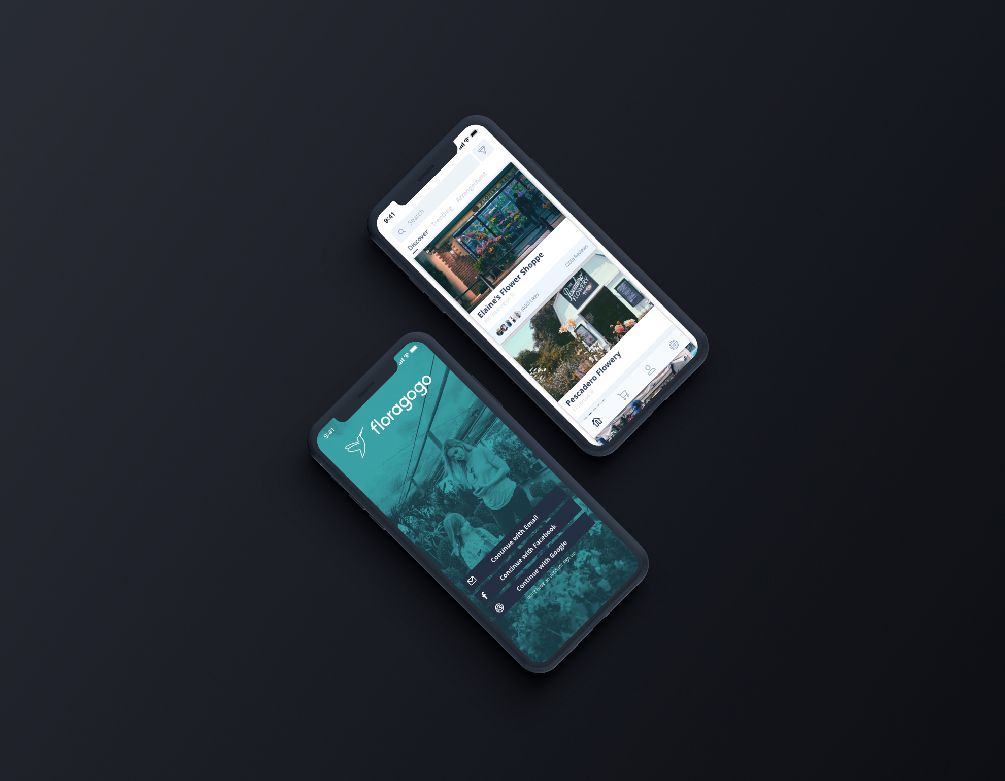
Low and High fidelity prototype
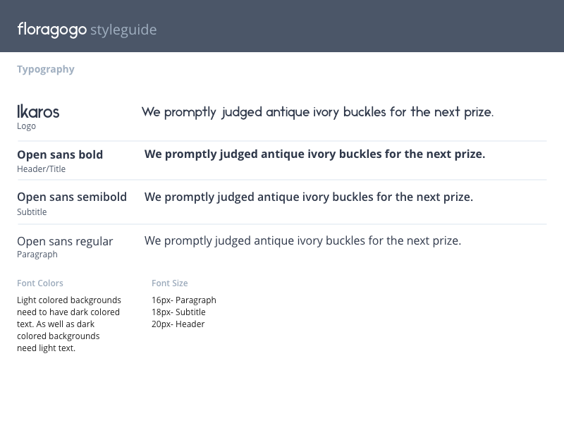
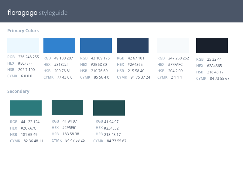
Style guide- color palette, typography, button, links, state, form elements
Image content and treatment
Designs in Mockup format
Research
By researching competitors in the market place like 1800flowers and Bouqs it is very clear that it is a market filled with competitors that are selling similar products. These competitors are focusing on occasion oriented events like holidays, prom, retirement, etc. Which also points to having that all the competitors are aiming for the same customer type. Additionally, since flowers are widely available, the overall customer experience is vital for repeat business.
Ideation Process
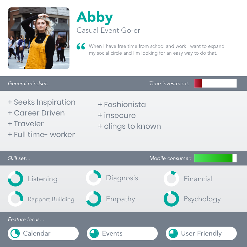
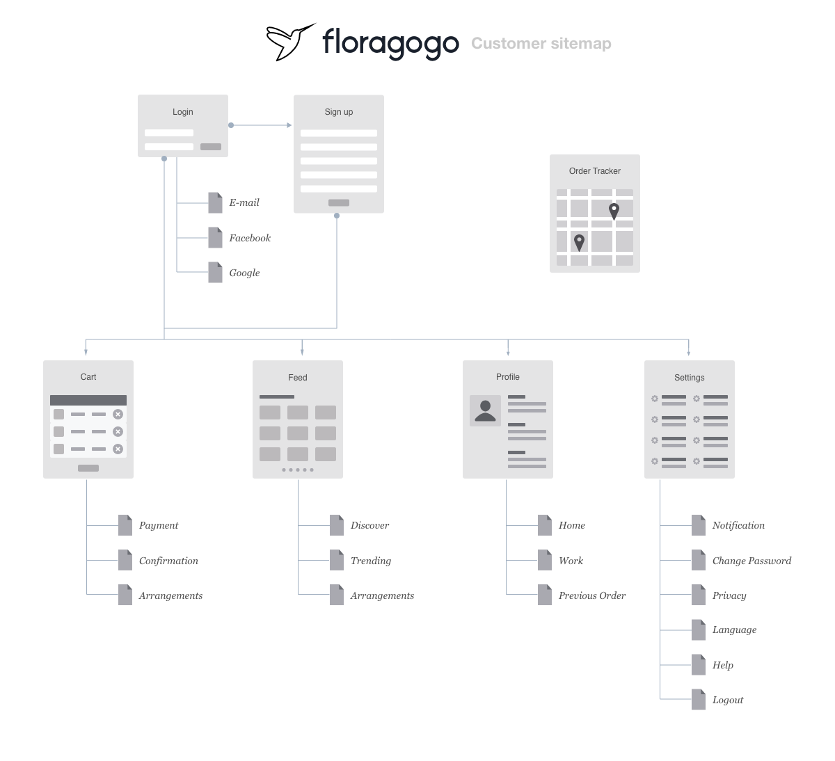
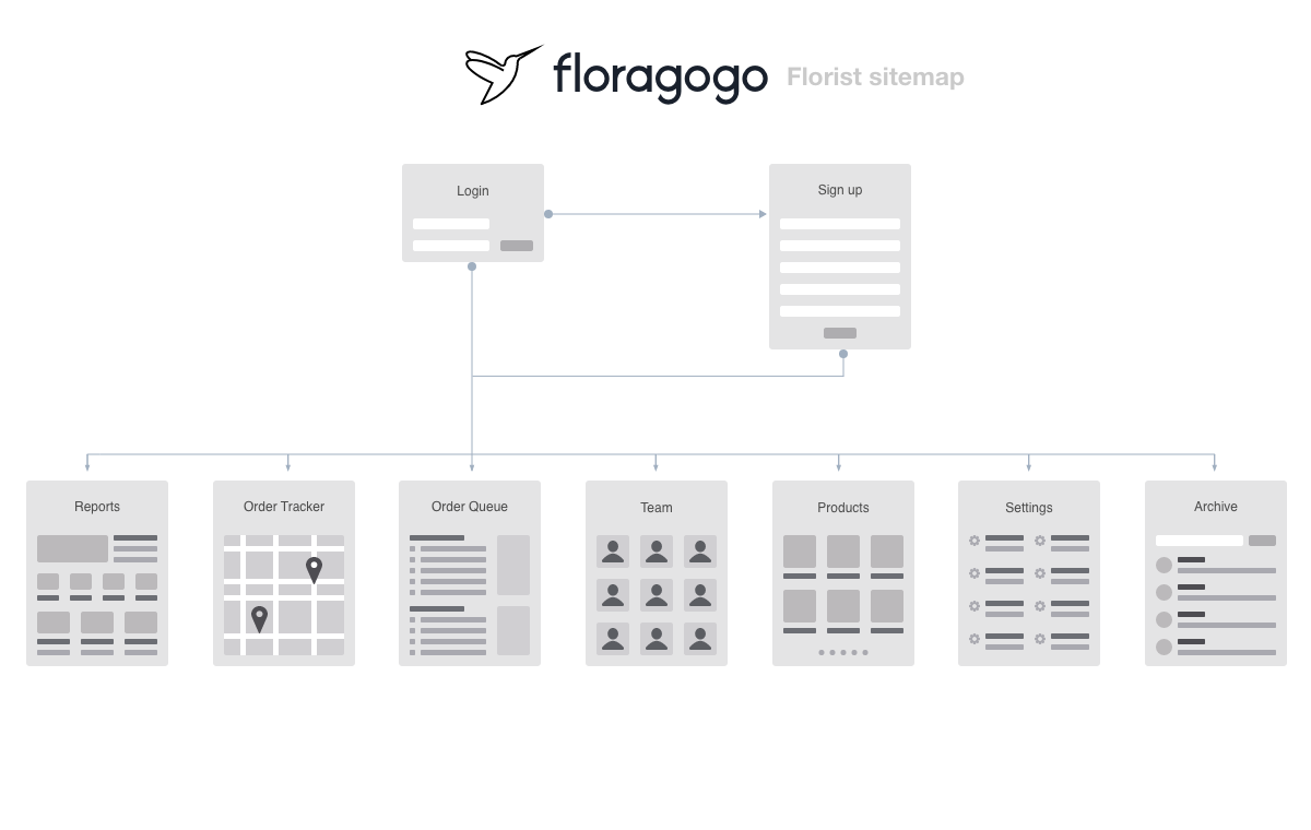
After doing competitive analysis research to create user personas for design direction. The following phase was the design research of other mobile app delivery services. Services like Grubhub, Uber eats have similar goals to Floragogo in which having a friendly user experience is key. Additionally, there are essential features that they share to build familiarity with users. I kept this in mind when going through the design process to build the app to take advantage of familiarity. Later, I began to create the sitemap to have a baseline of expected pages to transition creating sketches. After drafting sketches and reviewing it. I selected the best draft fit for the digital wireframe to make a low fidelity prototype quickly get feedback to make adjustments.
Challenges
The challenges were building an experience that was for mobile it was about finding the best layout for the project and also user-testing. For the layout, it was about the arrangement content to maximize how easy it went from start to finish with the least amount of pages as possible. User testing and calibrating the content from the feedback was very helpful in making the high fidelity version of the design.
Conclusion
The biggest challenge was to make this a user-friendly experience for customers without it being overwhelming. In this case, starting the with larger page set and then simplifying the page amount through user testing helped in making easier to navigate from beginning to end. By taking this approach users were less likely to get lost when navigating the app. From this point, developers could continue to improve the design through more feedback and prototyping.
Project
Floragogo
Client
Gabriel Lantigua
What We Did
UI/UX Design, Responsive Web Design